Triptych Poster Set
Client
Personal Project
Location
Nashville, TN
Triptych Poster Set
Triptych Poster Set
Client
Personal Project
Location
Nashville, TN
Year
Year
2023
Client
2023
Personal Project
Location
Nashville, TN
Year
2023

Nashville WeGO
Busline Design Concept
Client
Location
WeGo Bus line
Nashville, TN
Year
2022
Project Dilema
Tasked with improving the overall experience of Nashville, Tennesee’s central bus station, I have designed concepts for additional amenities that would better suit the riders of this local transportation with the aim to increase rider count While decreasing negative interactions.

Research


When conducting research for Nashville’s WE GO bus line, a few clear problems were present one being the lack of auditory/visual cues for disabled and or impaired passengers.
Speaking to passengers that frequented this bus line, common complaints of the local food market being closed or understaffed was a major pain point for riders who worked long hours and wanted food before their ride home.
Color Scheme
R: 67
G: 63
B: 97
C: 80 %
M: 78 %
Y: 37 %
K: 26 %
HEX: #433f61
R: 0
Being that the current color scheme follows the branding guides of “WE GO”, I believe that the current color schemes used are successful in providing a calm atmosphere.
To better allocate for funding, this color scheme will remain with changes to how these colors are dispersed throughout the central bus stop.
G: 0
R: 237
G: 33
B: 0
B: 39
C: 0
C: 0 %
M: 0
M: 99%
Y: 0 %
Y: 97 %
K: 0 %
K: 0 %
HEX: #fffff
HEX: #ed2127
TypeFace
Display
Poppins - Regular
ABCDEFGHIJKLMNOPQRSTUVWXYZ
abcdefghijklmnopqrstuvwxyz
123456789
Poppins was chosen as the font family for this project as this typeface offered a legible appearance that held a professional yet lively feeling.
This typeface also fell close to the currently used typefaces which would help with a seamless change in the brand without distracting long-serving customers.
Body
Poppins - Light
ABCDEFGHIJKLMNOPQRSTUVWXYZ
abcdefghijklmnopqrstuvwxyz
123456789
Self Serve On-Site Food Market
Currently, the on-site market for the Nashville bus system is open for customers from Monday to Wednesday 7:30 am to 3 pm.
While this system does work for those who are traveling on these weekdays, the implementation of a clerk-free kiosk with small snacks and beverages would allow travelers to purchase items any day of the week without introducing a kiosk attendant.
Colored with a site-specific color scheme, this kiosk would provide a welcoming feeling to many of the public transportation patrons.


Using a scan and pay self-serve kiosk, Customers will be able to purchase snacks and or drinks at their own leisure.
This system not only allows customers to pay without assistance but, a self-serve system also allows this facility to maintain its normal staffing without increasing an employee budget.
Walk Through Map

Ticket Kiosk Interface

My ticketing kiosk interface is designed to provide customers with a seamless experience when purchasing or reloading their We Go transit card. The menu is clean and simple, allowing customers to quickly find what they need without any confusion or hassle. Additionally, I have incorporated Large contrasting display buttons to ensure that visually impaired customer can easily navigate the interface. The overall goal of the design is to make the process of obtaining a transit card as efficient and accessible as possible, ultimately enhancing the overall customer experience.
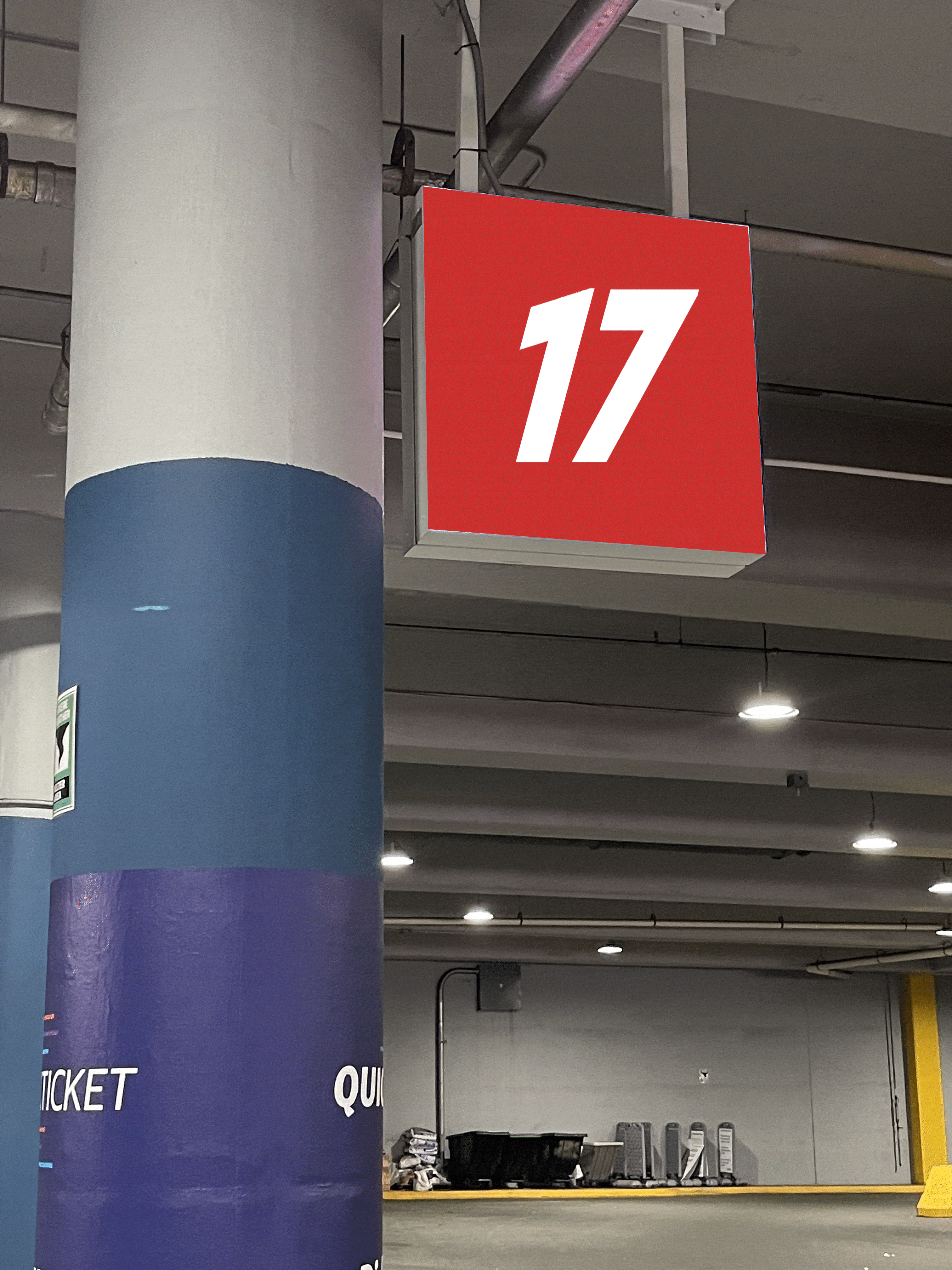
New Sign Display
To better help with the lack of information once bus routes change, static signs will be replaced with LCD displays that will attract attention when paired with a chime over the station's audio system.
This change will not only serve to catch onlookers' attention but also provide a modern experience for riders.
New Icons


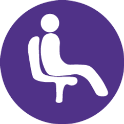

To better direct visitors, a new host of pictograms will be introduced to fill in areas that are yet to be covered by existing pictograms. With subtle coloring and shapes, these pictograms are designed with ease of understanding in mind.

